TITLE SEQUENCE SHOOTING & SYNOPSIS
For this project, we thought that our concept would be best demonstrated by creating a visual title sequence which would be able to clearly bring to the screen a kind of feel for our piece. I was in charge with the creative elements and how it would be shot & pieced together, as i story-boarded the whole sequence out first, in order to see how it would visually pan out. Creating the storyboard for the piece was challenging, as from watching other title sequences, you get a gist of what should and shouldn't be included in them. A opening title sequence that I've watched multiple times to get the creative juices flowing is that of True Detective, series 1. Here is a clip -
(True Detective: Series 1)
It first goes without saying that the title sequence for the first series of True Detective is unique. The aesthetic by itself would earn these titles “iconic” status. But that would result in overlooking what makes it especially remarkable: how it comments on and reflects character.
(Woody Harrelson)
After some research & further digging for a deeper understanding of this title sequence, I found the creative director of this specific opening title sequence, his name is Patrick Clair. He states that when he met the producer Nic Pizzolatto, the sequence was conceived around character.“He said that True Detective was using the polluted, exploited, broken landscapes of this part of America as a metaphor for the broken, exploited people at the heart of its story. Be that the main characters or be that the supporting characters. That led to a very simple thought: what if we made broken portraits out of broken landscapes,” which has been clearly carried out by Patrick.
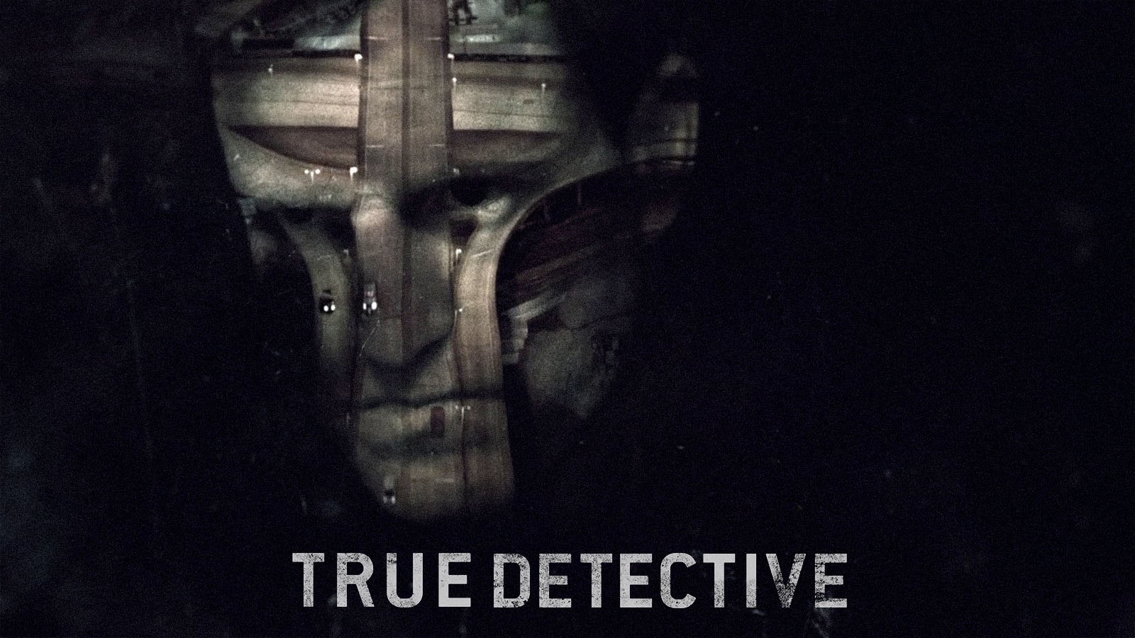
The environment is a vital component of True Detective, but never at the expense of the main focus on people. Deeply broken people, to be specific. The double-exposure symbolises that through conflicting pictures on each other, reflecting people torn between two different spaces. The slight, but overly extensive, movement in the silhouettes also signifies the forever stirring inner troubles and demons (E.g the fire that are show at the end of the titles) within them. By the time the opening is complete, a deep subconscious understanding of these people has formed, that this visual title sequence has successfully portrayed across.
So after studying this specific opening title sequence long & hard, I tried to figure out & establish an aesthetic that would best fit the theme of what we were going for, which is in some respects similar to True Detective, as it covers the same kind of topics. Obviously I did not want to see like i'd copied it, so for that reason when i was story-boarding it I made sure it was original, by combining archive footage with originally shot footage. I went off a rough write up which helped me through the mental process of storyboarding it, which is to see here -
Start - CU OF Hand cuffs on a pair of hands - CUT - Long shots of desolate landscape, archive footage - CU Of flames - CUT/DISSOLVE - Archive footage of police officers - CUT - CU of ash - DISSOLVE - LS kids running around CUT - CU OF GUN - FADE TO BLACK -
THE SHOOTING & MAKING OF THE OPENING TITLE SEQUENCE
I wanted to use a lot of archive footage because of the beautiful aesthetic is has, but also because of how well it fits in & compliments the piece itself. We're doing a vodcast which is shot like a period crime/drama, so footage from the 1940's fits with the tone & themes of our project and to portray that through the opening title sequence i felt was a must & definite choice. The use of original footage being intertwined with the archive footage was also a significant choice as i wanted old with the new, that juxtaposition between the two, even though some of the content was similar in style, the footage was visibly different. The fire was a pivotal shot that was needed, as for the first episode that we cover, within the narrative a house is burnt down and kids disappear. The fire that is shown in the sequence is representative of that, and for that reason is very significant to the viewers & to the narrative. The specificity of some of the archive footage was essential as i felt the topics being covered were quite harsh, cold, hard-hitting & bleak and to juxtapose against some of those themes i wanted certain elements of the sequence to have the opposite tone, i.e like the kids running around, as they portray some kind of innocence & gentleness amongst all of the chaotic cuts & other harsh elements of the flashing police lights, the flames and the gun. I feel the message that is conveyed through our opening title sequence is that of the theme & topics it deals with in this pilot episode, but also of what would of been dealt with in the next episodes to come as well.
The archive footage was gathered from Youtube & other sites that we were able to get it from for free. It took a long of digging & searching for the right shots, but myself & Aimee found some brilliant footage along the way. It was just searching for that specific period, and knowing what to look for, so that's why the storyboard came in handy throughout this process as the key shots were there, we just needed to find the right one to match up with the storyboard. The original footage i shot myself on my camera, (Sony A7S) I wanted to make sure that I was only capturing close ups with it as the quality plus the lens of the camera were better suited to take close ups. So capturing the fire & gun was quite straight forward. The original footage was shot on S-Log2, that was so when it came to post-production we could colour grade it to fit appropriately with our aesthetic. However once it came to the edit we realised that the colours actually matched already with it having no colour correction, this was due to the S-Log footage being very dull & bleak, for it creates a greater dynamic range within the footage for you to colour grade with. In that sense we were fortunate it had the perfect aesthetic already.
COLOUR
I wanted the colour of it to be quite flat, monotone, with a lot of grey, black, light grey, spanish grey & silver. The overall colour palette was to be just dark & dull, as it signifies what kind of themes are going to be covered throughout the series. You associate these kind of colours with crime & justice, flashing imagery, the blue & red with the police, but then also the greys with things that have occurred in the past, as is demonstrated within the title sequence, (the archive footage). Shooting with S-Log2 gave us that flat feel to the footage, and when placed together with the archive, they went hand in hand & conveyed the key elements in a way that told the audience what kind of narrative they were going to experience.
Here below is the opening title sequence for our hypothetical pre-production unit -
TITLE SEQUENCE EDIT
(Opening title sequence)
CONCLUSION
All title sequences have that same hardcore element & are driven by the same thing, which is to try and accomplish—conveying concept, tone, theme, and more—what makes them perhaps stand out more than anything? They celebrate the stories they’re leading into. It’s why they’ve embedded themselves so firmly in our minds. Angus Wall, (Editor of Social Network) said that a great opening titles sequence “does something essential to the viewing experience that the show can’t or won’t.”
Because when we see these sequences, whether it’s at the beginning of an episode, during a rewatch, or a random YouTube viewing, they make us think of the stories these shows tell us, and what they mean to us. There’s no greater compliment than that for an opening title.
Because when we see these sequences, whether it’s at the beginning of an episode, during a rewatch, or a random YouTube viewing, they make us think of the stories these shows tell us, and what they mean to us. There’s no greater compliment than that for an opening title.
No comments:
Post a Comment