Wednesday, 17 April 2019

Major Production - Re-shoot for more coverage/green screen


We had already established that something was needed within the edit to piece together each hallucination scene, so I came up with the 'tunnel' concept, where we'd have singles of each character, a slow track in on their face, to signify whose mind we, the audience, would be entering. I'm not sure why this wasn't thought about before, maybe in Will's head he had it all figured out but then it came to the edit and it didn't work/pan out how he had envisaged? Either way we had found a solution to this issue that had arisen in the edit, making life easier for Aimee and giving our production a higher quality.
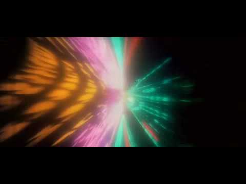
Image result for 2001 space odyssey stargate sequence
(Still shot from 2001: A Space Odyssey, Dir. Stanley Kubrick. 1968 - Star gate scene)

I took inspiration from the film 2001: A Space Odyssey, Dir. Stanley Kubrick, 1968. There is a scene towards the end of the film, where the protagonist is travelling through the 'Star Gate', which is extremely powerful in it's visual interpretation of space travel. It has lots of layers, and for its time its astounding that the impact the sequence still has on the viewer is as effective as it was back when first released. I wanted to emulate this kind of sequence, after researching how this actual sequence was put together, I knew I couldn't actually achieve this aesthetic, but I could create my own take on it and so I began to think of ways that we could. After discussing with


CAMERA SETTINGS
f/3.6
ISO - 40
Shutter Speed - 1/50 
White Balance - 5000K
UNGRADED
Track & Dolly
UHD(4K) - 25FPS
MONDAY 8TH APRIL
We booked out the room for Tuesday 9th but had set up the room on the 8th so that we could prepare for the actual shoot day with the actors. Aimee and Ebony had set the green screen up, and I had the camera sorted, unfortunately we did not have the track and dolly for this day as Drey and George had it booked out. So for this practice run through I thought on my feet and had Will push me on a wheeled chair whilst I held the camera. This technique unfortunately didn't really have the desired effect that we had hoped for. The footage from it was too jittery and extremely hard to keep the target in focus, as my arms were being jolted by the wheels changing direction continuously. The green screen however looked fine, and I had Aimee do a quick test of the green screen before we shot with the actors just so we knew it would actually work. We did find that the green screen wasn't evenly matched with the lighting, so I manoeuvred the lights at an equal distance and at the same light strength in the hope that it would come through to the edit with a clean back drop once we corrected it. Another issue I had was trying to keep the object in focus for the track in, which I was struggling with massively, so I thought it would be best to use the auto-focus on the camera. I switched from using the manual focus to auto-focus in the practice run and immediately felt more comfortable. All my responsibility now was keeping the object/character in the centre of frame, which was much more manageable. Furthermore, I spoke to Ferg briefly about our concept and goals with the green screen, and he was extremely informative about how to get the best out of it and what things to avoid whilst using it. He stated that you need to have quite a distance between your subject matter and the green screen, to make sure that the green screen is not in focus/not sharp so that when you apply the alpha key (essentially turning it black) it's super smooth and the image that is presented on it looks authentic. I took the information on board, went back into our set up and started to make the distance between the subject matter and green screen bigger by moving it back. 

As well as the green screen footage we needed, Will also wanted to re-shoot certain shots from scene 9 and scene 14 as he wanted more of a performance from the actors, so me and Callum set up at the location in preparation for filming. These scenes were when they first take the drugs, and when they begin the podcast. We were unfortunately not going to have Andrew their for recording, as he had prior arrangements, at first this didn't seem as such a negative, as in the majority of the groups head we were just getting more coverage and we wouldn't actually need sound. However Will had wanted to shoot the scene from the top, with sound, this obviously must of got lost in communication, so we had to make the best of a bad situation, and Aimee had to jump on the sound. 


(Green Screen test footage)

(Practice run through of the green screen footage, Monday 8th)

TUESDAY 9TH
It came to the actual filming day with the actors, and as everything was pretty much set I wasn't nervous at all about how the day would pan out. We got to the studios with the actors and began filming. A bonus was that Drey and George had finished with the track and dolly so we were thankfully able to utilise it. I wanted to use the track and dolly to give this production more of a dynamic feel, as discussed in the group after watching our rough cuts, we felt there wasn't anything that particularly blew us away with our piece. It did get me thinking about our shoot days, and why we didn't try more dynamic camera movement, however Will was pretty consistent with what he wanted, I would try to spice it up, some idea's were tried and others were met with resistant resulting in not attempting. Anyway, we knew that this particular shot would add a greater depth to the narrative and would piece the hallucination parts together, so we had to master it, and we did, several times. We did it from several angles, moving only the track and dolly, and the subject would stay where it is, so in the edit, we could do a extremely fast paced cuts between each character, and clearly indicating which character's hallucination we were about to enter. We felt we had to make this clear as the prior viewings to our rough cut had been met with questions over confusion about whose mind we enter first. Then we went back to our main location to record more coverage and to re-shoot from the top scene 9/14 collectively. Myself and Callum had set up the mise en scene on Sunday, so we were all ready to go once the crew and cast arrived. This sped the process up massively, saving us a lot of time sorting everything out when the actors were on set. 
As I mentioned earlier regarding the miscommunication amongst ourselves about shooting scene 14 from the top, and not having Andrew for our sound, did impact slightly on our stresses on the day of filming. 


EQUIPMENT LIST - 
Track & Dolly 
Tripod
Panasonic DVX 200
Tungsten lights
3x LED Lights
Green Screen 


SET UP FOR GREEN SCREEN -


WHY
The whole reason of this re-shoot for more coverage, was to add more dynamism and production value to our project. I knew we needed something to piece together the hallucinations and to also signify clearly to the audience whose mind we were entering first/next. So that's why I came up with this concept, which I feel we successfully pulled off. It's up to Aimee now, what she wants to project onto the green screen, but some kind of effect that emulates a similar aesthetic to that of Kubrick's, 2001 Space Odyssey, will be the desired one. The framing for the shot was quite tight, I made sure to do a mid shot, mid close up, close up, and extreme close up. As i've been an editor before for other projects, I always know how valuable it is to have as much footage to play around with, and from experience, the more footage you have, the better. Obviously from the practice run the day before we knew shot for shot what we needed out of this, but when it came to the day I experimented after getting the essential shots, and had the actors face the wall, and on my command I would have the turn and stare down the camera lens. This was just a quick idea that came to my mind, I thought it could work in the edit, but i'm not sure if Aimee will use it. In my head a slow track in and then when I shouted 'Go' they'd turn and I'd increase my tracking speed, seemed quite jarring and unsettling, which is what their character's mind state would be like. After research as well, in relation to how to make your characters seem as if they're in a challenging psychological state, you're meant to play with the movement a lot, and how you have your subject matter set in your composition.   


To conclude, I felt that the day's of filming were a success, from my perspective in terms of the camera work, as I captured what I set out to and hopefully adding more depth and dynamism to our project. We need to see how it will come up in the edit now, with imagery and vast sound effects essential to making this narrative far greater than it currently is. As we're approaching the end, I can see it slowly being pieced together, bit by bit, maybe not at the rate that I would like, but unfortunately there isn't anything I can do about that. 


Monday, 8 April 2019

Major Production - More colour grade research


I decided to further develop my understanding of colour correction and started to read several books which covered many different aspects of colour grading which I hadn't even crossed my mind. Before this project I took the colour grade for granted, and did not expect it to be as time consuming as the research has led me to believe. I now know after this extensive study of the element that a lot of time and precision will be needed to carry out this task.

Following on from that, I discovered that they are six key components to what a colour grader should be focusing on. These are called:


 THE SIX LABOURS OF THE COLOURIST 

CORRECTING ERRORS OF COLOUR AND EXPOSURE
Images acquired digitally almost never have optimal exposure or colour balance to begin with. Just one example of this is that digital cameras deliberately record blacks that aren’t quite at 0 percent in order to avoid inadvertent crushing of valuable shadow detail.

MAKING KEY ELEMENTS LOOK RIGHT
Every scene has key elements that should be the focus of the viewer. In a narrative or documentary video, this is probably the people in each shot. In a commercial, this is undoubtedly the product being sold (the colour of packaging or the glossiness of a vehicle). Whatever these key elements are, your audience will likely have certain expectations of their appearance (referred to in this book as audience preference), and it’s your job to navigate the difference between the uncorrected shot and the preferred image characteristics that correspond to the key subjects within. A common example is one of the guiding principles of colour correction: All things being equal, the skin tones of people in a scene should look as good as (or better than) those in real life.

BALANCING SHOTS IN A SCENE TO MATCH 
Most programs, narrative or documentary, incorporate footage from a variety of sources, shot in multiple locations over the course of days, weeks, or months of production. Even with skilled lighting and camera crews, differences in colour and exposure are inevitable, even in shots being combined within a single scene. When viewed together in an edited sequence, these inconsistencies of colour and contrast cause individual shots to stick out, making the editing appear uneven and throwing the audience out of the scene. With careful colour correction, all the different shots that make up a scene can be balanced to match one another so that they all look as if they’re happening at the same time and in the same place, with the same lighting. Although this has traditionally been referred to as scene-to-scene colour correction, I refer to it in this book as a process of shot-matching and scene-balancing.

CREATING STYLE 
Colour correction isn’t just about making every shot in your program match some objective model of colour balance and exposure. Colour and contrast, like sound, provide another level of dramatic control over your program when subtly mixed and adjusted. With imaginative grading, you can control whether the image is rich and saturated or muted and subdued. You can make shots warmer or cooler and extract detail from shadows or crush it, all with a few turns of a dial or trackball. Such alterations change the audience’s perception of a scene, setting the mood.

CREATING DEPTH 
As Vittorio Storaro says in the 1992 documentary Visions of Light, one of the cinematographer’s jobs is to create depth in an essentially two-dimensional medium. With the tools available in modern grading applications, this task also falls to you to implement where improvements to the original image are possible. This has nothing to do with stereoscopic imaging and has everything to do with simple, two-dimensional principles of how colour and contrast affect our depth perception in various scenes.


'The more you know about how colour and contrast is manipulated on location through all of the tools of the cinematographer’s craft, the better you’ll be able to analyze and manipulate each clip. Furthermore, the more you know about how a film crew works, the better you’ll be able to conduct the detective work necessary INTRODUCTION xxi to figuring out why one clip isn’t matching another. ' (Hurkman, 2010:21)


WHAT HAS BEEN APPLIED TO THE PROJECT FROM THIS RESEARCH & WHY IMPORTANT 


image
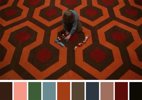
(The Shining, 1980. Dir, Stanley Kubrick)


THE COLOURIST’S RELATIONSHIP WITH THE CINEMATOGRAPHER

Many, many people involve themselves in the postproduction process. As a colourist, you’ll find yourself working with the producer, director, and cinematographer in different proportions that are unique to every project. The cinematographer’s job during the shoot is to work with the director to plan for and implement the look of the program while it’s shot. Choosing specific digital formats or film stocks, camera equipment, and lenses, as well as determining the quality of lighting, are all decisions within the cinematographer’s domain of responsibility, as is the ultimate quality of the recorded image. For that reason, the cinematographer has a vested interest in your activities. It’s worth emphasizing that if a good range of color and contrast isn’t shot during the production, you won’t have the data necessary to do a good job—you can’t really add anything that wasn’t there to begin with. In this regard, the cinematographer isn’t working alone; you should also consider that the art department (set design/dressing, props, wardrobe) exerts direct control over the actual range of colors that appear in each and every shot. Visually, the filmmaking process is a symphony of artists working with paint, fabric, light, and optics to create the image that is ultimately entrusted to your care. Although the producer or director usually has the final say over the creative aspect of your work, the cinematographer should be involved in the color correction process as well. This is usually dependent on the size and budget of the project, as well as the creative relationship of the principals. Typically, the higher the budget, the more involved the cinematographer will be.

I thought it would be important to highlight the research found for the relationship between the cinematographer and colourist as I'll be both. There is a key correlation between the two, one cannot work without the other and they need to be in sync, shots need to be thought about for the post production side of things for a project to get the optimal level of work. In short, this detailed research of the six labours of the colourist has helped me approach the colour grade in a completely different way to what i'm used to. It has made me realise that I need to make sure I bring the subject matter in focus within the scenes that are appropriate. I'll need to collaborate with Will as well to maximise the colour grade as I can find out from him what he wants to be the main focus of the shot for the audience to be engaging with.


image

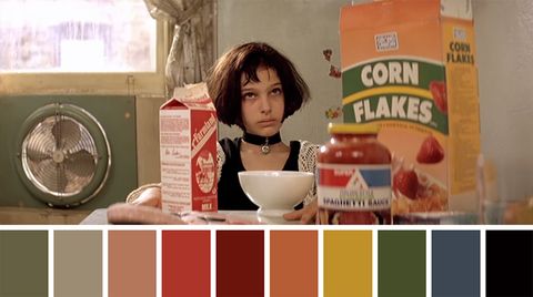
(Leon: The Professional, 1994. Dir, Luc Besson)

With this colour grade of this screenshot from the film Leon:The Professional, you can see the colour palette is quite subdued in terms of colour, they're not saturated, more so quite dull and lethargic colour tones which put emphasise on the story and the characters within it. These moods that the colours represent convey not only the narratives themes but the characters struggles throughout this film. Natalie Portman's skin tone looks the same as the wall behind her, this is evidently intentional as we are meant to assume that she is going through some hardship, quite an ugly one, as the similar tones between herself and the wall denote this. Everything on the table seems to be sapped of saturation, when usually all of these items would pop with colour, this is because the characters are run down, so to put emphasis on that they've dulled the palette and taken away the saturation for this reason. 
I chose to dissect this specific film because of the subtle desaturated look it presents. As our film would be using quite a heavy saturated aesthetic to add to the surreal tones to our piece, I thought it'd be a good idea to look at something completely opposite to gauge how far down the other end of the spectrum I should go. One thing though that I will be applying to my process of the colour grade will be trying to emulate the consistency of this film. The colour palette is evident throughout the entirety of the film and that's something that i'm striving for as it adds another layer to your film in my opinion. I think this can be achieved by manipulating my footage to have a similar temperature, like this piece here, it has quite a nullified, slightly warm look, where as I want a much more saturated aesthetic. Obviously this film needs a desaturated aesthetic as it's content warrants such, because of the violence and innocence displayed within it, it must have a balance, which why it results it this very beautiful aesthetic. 


image


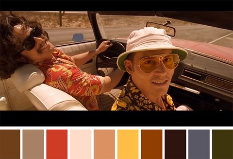
(Fear And Loathing In Las Vegas, 1998. Dir, Terry Gilliam)
Within this film, Fear and Loathing In Las Vegas, once again their is a clear stylistic colour grade that heightens the narratives plot and drives it forward. The colour grade brings to life the hallucination scenes and is one of the major reasons I want to dissect this film for it's colour grade. Throughout the entire film there is a specific colour palette used, stated above. It's a very vibrant, surreal and vivid aesthetic deployed throughout the majority of the film. Then once we get onto the hallucination the colours simmer down and the darker tones tend to appear, more of the browns, blacks and navy's. There needs to be a change within the colour grade for these scenes as the colour grade has a major role in allowing the audience to realise the change of mental state for these characters. Without the change in colour grade, the audience may not realise what the characters feel. What I found extremely useful from this anaylsis is that i'll apply this to our projects hallucinations, making them a completely surreal colour tone to juxtapose against the colour tone of when they're recording their live podcast. This will highlight the change of mental state of each character, helping the audience gauge what's unfolding within the narrative. 
I believe this film was incredibly successful in the way it's colour grade demonstrated the characters minds during the hallucination scene, but also how the saturated colours were made to seem normal when they were juxtaposed to the hallucination scenes. I aspire to colour grade how this film was, but I know for sure that most of the film was shot like this first, and then a tint would of been applied onto the exposed film. The skin tones look relatively peachy throughout the skin, and you don't question this because you know the concept of the narrative so if anything it makes even more sense to do so. The fact that they look unrealistic enhances the viewing experience because you're allowed to submerse yourself into this bizarre and surreal story. This is definitely something that I want to try to achieve with our project, I want to make it look surreal with the colour grade by making the skin tones slightly off, making them potentially peachy or of a similar colour because I know that this aesthetic would work well for our project. I'll just need to try it once we get to the post production.


Reference - 

Colour correction handbook - Professional techniques for video and cinema, 2nd Edition 
Alexa Van Hurkman - Published 2010. 

Friday, 5 April 2019

Major Production - Research on effective film trailers


As I was in charge of creating the trailer, I thought it would be wise to research how to create effective trailers. I started by watching several trailers and delving into what actually makes them successful, distinguishing themselves from the rest.  


Remember the trailer is also a story

'A trailer shouldn't just play like a showreel of the film's greatest hits. Just like any edit, a strong narrative is key. Don't get bogged down trying to tell the whole story, but find a strong narrative through line. You're creating an adaptation, an abridged version of the same story so find the core theme and build around it.'

I've watched a mixed bag of trailers, some good, some bad, and what i've noticed with the bad ones is that they present the whole film, just an extremely shortened version, showing the supposedly best bits of the film in the hope that it attracts the audience, which is a huge gamble, and often works to grab the audience in to pay to watch it, however then fails at being a convincing film. 
EXAMPLES OF BAD TRAILERS/ 
Image result for velvet buzzsaw
(Velvet Buzzsaw, Dir. Dan Gilroy)

One prime example of this is a film trailer I watched recently, then going on to watch the actual film with such high expectations, is Velvet Buzzsaw, Dir. Dan Gilroy. Having watched Dan Gilroy's Nightcrawler, I already had quite a biased judgement of the quality of the film, as I found Nightcrawler to be a hugely successful film, with a fantastic original narrative & technically sound as well. So that's why after I watched the trailer for this film I was pretty ecstatic and hyped for the release, which would be straight to Netflix, which was my only reservation for the film, as I do question big directors/big cast list films that go straight to Netflix, as I feel they have less of a soul than films that go to the cinema first. However I believe that this is the way film is going, unfortunately. Back to my point, the trailer clearly had the right effect, gripping me, leaving me wanting more and preparing myself for the release date. Unfortunately, I was majorly let down and my expectations plummeted after the first 10 minutes of the film, I began to question the script, the technical style, (or lack of) the bland narrative arch, the motivation of the characters, their back stories, it lacked quality in every department. The cherry on the cake though was that the trailer left me knowing every detail to each of the characters death, the trailer had left nothing new to be witnessed by the audience. So for that reason, the trailer presenting pretty much the entirety of the film, makes it a floored and pretty poorly assembled trailer. 

https://www.youtube.com/watch?v=XdAR-lK43YU

Deconstruct the film

'It's important to disconnect from the film and pull it apart so it'll become the building blocks if your trailer. Think about the film being a completed jigsaw. You need to pull it apart and find the pieces to make a new, smaller (but no less complete) picture. It's important to see each visual unconnected to the film so you can repurpose it into your new adaptation of the story.'

EXAMPLES OF GOOD TRAILERS/
Image result for Sorry to bother you
          (Sorry To Bother You, Dir. Boots Riley)

A perfect example of a really successful film trailer would be for the film Sorry To Bother You, Dir. Boots Riley. This film adopts all the techniques that a fantastic film trailer uses i.e deconstructing the film, highlighting who the main protagonists are, withholding some of the best bits and keeping stuff hidden until you actually watch the film. The trailer introduces us to the world that the protagonist lives and the struggles that he faces. It is presented in a way that suits the style of the film and adheres to the genre of comedy. This is done by it's punchlines and quick rythmic editing style and the colour grade given to it, clearly making it a comedy. This trailer is a success because it grabs you straight from the off, you can see the clear arch and the characters conflict along the way through the trailer, he needs a job as he's struggling to pay rent, he finds a job and realises it's morally questionable, it's either the job or his girlfriend, he thinks it's a easy decision until the fee of the job is disclosed then the conflict and chaos erupts. Now seeing as i've viewed this film I know that there is an extra 20 minutes of the narrative that has no spotlight shined on it whatsoever in the trailer, and those 20 minutes are extremely pivotal to the narrative! This therefore comes as a complete surprise whilst viewing the film in the cinema, making for an even more special and intimate experience, (Obviously not if you didn't watch the trailer before the film) so therefore the trailer has been successful in the sense that it has won you over without even needing to show you the the full narrative arch. The music used throughout the trailer is energetic, pulsating and extremely catchy, this reinforces the general themes and tone of the film, and what we're to expect when we go to see it. Overall this film trailer was effective in its usage of specific scenes and how it managed to present itself as the full film, it was cleverly put together. Whoever is reading this, if you haven't already, please go and watch this film!  
Trailer link -

https://www.youtube.com/watch?v=PQKiRpiVRQM


Remember your characters

'Try and give the main characters a moment that defines them in the trailer. Giving the actors a little time to shine within their performances will give your audience people they can identify with.'


BLINDSPOTTING -
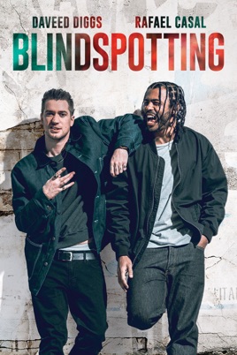
Image result for Blindspotting
(Blindspotting, Dir.Carlos López Estrada)

After watching Sorry To Bother You and Blackkklansman, I started reading reviews of the films, which lead me onto the film stated above, Blindspotting. I believe the trailer for this film has successfully utilised every technique the creators of it had to their disposal. Its held the protagonist at the forefront of the trailer, Collin Hoskins, played by Daveed Diggs, shown him travelling on his arch laying bare some of the conflicts he faces a long the way. I believe this is a wonderfully pieced together trailer because of the rhythmic editing style it deploys, also how it strikes the balance between the serious and comedic value topics throughout the trailer. As the film is more of a poetical societal commentary of the american police brutality, the trailer knows how to play each scene for the audience to gauge what to be taken seriously. and what not to. Again, this is quite similar to it's structure to that of Sorry To Bother You, in the sense that it holds back once again, hooking the audience and then leave them wanting more. It presents a lot of powerful and moving imagery towards the half way point of this trailer that totally flips this film on its head. It starts as this light-hearted comedy, then suddenly turns into this chaotic, monstrous and unprecedented piece of drama which totally takes you by surprise. You feel anxious past this half way point, and it leaves you wanting to know if the protagonist has managed to survive his last three days on tag or not, and has he been locked back up again. The film sells itself at first as quite a cheesy, generic blanket release film that is covering pretty topical issues, however this is where I feel the trailer may of lost it's way a bit. As i've seen this film, I know what it's political message it's trying to convey, but also shed light on wider issues such as gentrification of urban areas and white washing things until the originality is lost. The trailer doesn't truly allow the audience to see the deeper meaning behind this film and for that reason it does not have the same success/effectiveness of a trailer than Sorry To Bother You. 
Overall though I will be taking techniques from this trailer such as the rythmic editing and cutting to the music. It intensifies the narrative and is able to grab your audiences attention much quicker. 


Trailer link -


To conclude I'm glad that I did this research before the making of it as i'll be applying everything that i've learnt from these trailers. I'll also look into TV series trailers, specifically sitcom ones to really gauge what I should be presenting and how much I should show of the project. I don't want to give away too much of the film, like Velvet Buzzsaw demonstrates, but on the other hand i'm not sure if our piece will have enough juicy content like Blindspotting or Sorry To Bother You, to avoid not using the juicy stuff. I obviously want to sell the narrative so in my mind putting the best scenes in there is my first reaction but I don't want to over sell it and then leave the audience bored because they know all the best bits. I'll have to think more carefully about how I approach this one when it comes nearer the time of creation.


With reference to -
https://www.creativebloq.com/audiovisual/perfect-trailer-51411685

Major Production - Colour grading second edit

After a long and tedious trial and error procedure, I finally got round to choosing a LUT that myself and the group believe suits the tone and the feel of the narrative. There were some conflicting opinions but I came to a compromise with Callum and Will as both wanted slightly different tones to shine through. It was about giving it a warm yet surreal feeling which simultaneously matches with the narrative of the project. I knew that there was still a lot of work to do with the colour grade, as certain scenes needed further manipulation to match up with the rest of the sequence, as some shots were better lit than others.  


(Colour grade nearing completion)

The colour grade that we had all agreed on was the Amira Default LogC2REC709 LUT. This was actually the LUT that we had applied to our footage in the shoot week, which was quite frustrating considering all the time I'd put into trialling the many other LUTs I'd downloaded, but finally we'd found a LUT that fit our piece, obviously it needed manipulating ever so slightly so I did that. There were some slight issues however, as Aimee started the edit on her laptop with her premiere pro, when trying to used that saved premiere file on the university macs, it wouldn't allow it to open as the version on the macs is the older one. So this meant that I had to colour grade on Aimee's computer, which was very time consuming and pushed everything back as this also meant Andrew had to edit the sound on Aimee's laptop as well. 
One of the main things was having a consistent aesthetic, so I did this by starting off with a peachy kind of tone, which Callum didn't really like. So after correcting this by slightly taking down the temperature and upping the highlights of the adjustment layer on top, it created on the image a very nice and balanced piece. I thought the peachy tone was quite nice if I'm honest as it was obviously not natural but that's what we were going for. It's a surreal sitcom so nothing is really meant to make any logical sense, but Callum wanted it to look like the Inbetweeners which I disagreed with as that series concept is completely different to ours and is way more realistic. But I went with what he said because he was the producer and Will and Aimee didn't really argue my case. So after sorting this out, it allowed me then to be slightly more creative and focus on the juicy parts of the narrative like the hallucination scenes. 


LUT - Amira Default.LogC2REC709
Temperature - -9
Tint - 0
Exposure - 0 
Contrast - 11
Highlights - -83
Shadows - 40 
Whites - 55 
Blacks - 0 

These were the colour correction settings I had towards the end of this colour grade session, everyone was in agreement that this aesthetic should be the way forward for our project. For the next grade i'll be focusing on the key areas like the hallucination scenes, penguin scene and raid scene. I'll have really experiment and get out of my comfort zone with these scenes as to attempt to bring the surreal themes to the forefront of the narrative.  


WHY
I felt this colour was significantly more appropriate than the rest I had looked at and tried due to it's balance between the natural and unnatural. It has elements of the surreal, but that will be further developed with adding more of a vignette effect to reinforce the narratives overriding tone of surrealism. 
The reason why the temperature is so low on the settings is because of the white balance setting I had the camera on whilst recording. This created the peachy tones once I applied the LUT to the raw footage, so I had to bring down the temperature to balance it out and give it a slightly more natural yet surreal look, as stated before Callum wasn't overly keen with the peachy tones. I didn't want to play around with the tint of the grade, as that would only bring in high greens which I felt wouldn't fit in with our narrative, however saying that I might play with the tint once it comes to the hallucination scenes to see if we can make them more dynamic and energetic. Throughout the majority of our project the exposure wasn't really needed to be played around with as I got the right strength on the LEDs there and then on the shoot days. However once again it may be manipulated when I start working on the hallucination sequences, especially the plant scene as on the day of the shoot it was extremely sunny, so maybe bringing the exposure dial down a few notches would be ideal. The contrast was used ever so slightly only because people had disagreements on using it. I wanted to heighten the contrast as it made the image pop more and from reading how to great a surreal/psychedelic look on your image, the contrast should be heightened. Unfortunately my team didn't really agree with me and my hand was forced to keep it slightly more natural than what I was hoping to go for. I wanted the highlights to be pretty low as it brought out the skin tones of each character more appropriately, I felt this gave more of an identity to the individual characters which Will agreed. The shadows and whites were increased as this was to create more depth between the characters and their surroundings, it gave the image increased quality and authenticity. I left the blacks at 0 because I found that when I increased it the whole picture lost its saturation so I felt it was the right decision to not utilise that creative tool. 


(Settings for the most recent colour grade)

WHAT HAS BEEN LEARNT & EVALUATION 
- Slowly mastering the art of colour grading, and I now know what is needed for the whole project which is a great benefit for myself and the team. 
- Listening to the team is important for this process, but sometimes I feel too many people are getting involved with the creativity and obviously not everyone will have the same opinions, so we're clashing and no one is really making a major point as to why we can't have it a certain look. Only stating it isn't the right look, not offering a solution. 
- There's still a lot more to do, I need to focus more on the hallucinations and make them feel like and actual hallucination by amplifying the colours within the scenes.
- Overall i'm happy with the progress being made, but I can only go so far with it as Aimee and Andrew need it to finish the actual edit, I don't know who decided to make this decision in regards to using just one laptop, but its beginning to hinder our production pace.  


Wednesday, 3 April 2019

Major Production - Colour grade on first edit

So after some extensive research of how to colour grade Log footage, i've been lead to these things called LUTs, (Look Up Table's) now what these things are, are different aesthetics and colour schemes that you can apply to your footage, and then manipulate that even further. These LUTs go hand in hand with Log footage, as shooting in Log increases your dynamic range, (which is basically just heightens the contrasting shadows and well lit areas of your shot by adding more depth & colour to them).


 What is a LUT?

A Look-Up Table (LUT) is a file with .CUBE or .3DL extension, containing maths instructions
to replace a colour (based on RGB value) by another one. It's like a colour grading preset.
This process is done pixel by pixel with a very high accuracy.
These LUTs are compatible with images shots from all cameras.

There are a lot of websites which offer these LUTs, but it's about finding the right one that will fit our piece tonally and crucially add more to the narrative as colour plays a pivotal part in doing that.
(Helpful colour chart found on my researching trails)


Coming into the studio since being back after a few weeks of absence due to health - I'd already done a lot of research on what LUTs would be effective and how to get the best out of them. I'd watched a lot of tutorials as well on how to get the best quality out of overexposed and underexposed images too. It was time now to start applying this research to my actual project. It helped though that I had done some extensive research on how to approach the LUT selection process and how to grade footage, here were the few simple steps I followed. It helped though that I had done some extensive research on how to approach the LUT selection process and how to grade footage, here were the few simple steps I followed.  


 1) Adjust colors and tweak your image BEFORE the LUT. Your LUT is adding a certain style to the footage, if you don't want to mess with the style, tweak your image before the LUT so that the LUT is the last thing the colors hit.

2) If you want to change the style of the LUT, adjust AFTER the LUT. But, be careful as most LUTs will do some kind of limiting to the image and may "Bake in" certain colors or lose detail in the highlights that you can't get back while grading after the LUT.

3) There are no MAGIC LUTs. There isn't a LUT out there that can make all of your footage look great 100% of the time. LUTs are designed for ideal WB and exposure. That means if your image isn't exposed or balanced correctly, you'll have to adjust the image before the LUT.

4) Don't use a LUT for no dang reason. Know why you're choosing a certain LUT or look. Be informed and make creative decisions. If you don't know why you're using a LUT, maybe consider if it's good for your camera, lighting, and feeling you want the viewer to experience. Remember, LUTs are just a part of color grading, which is a very artistic medium. Don't slap any old LUT on your shots and call 'em good.

I came in the studio with lots of LUTs to apply to the project and knew it would be a trial and error process. Here are the downloaded LUT batches that I started out with at first, each one had about 30 - 50 different LUTs within them. 

GSG - LUT sample
FG - LUTS
LUTS for Adobe premiere 
PB - 17 Luts
Cinematic LUTS 
Wanderlust LUTS
GrayScaleGorilla LUTS

The luts that I acquire from the wanderlust and GrayScaleGorilla set were really dynamic and tasty, so I thought i'll keep to these ones and figure out a way to manipulate them even more to fit the tone of our piece. A lot of my colour grading knowledge had came from Youtube video's which I watched constantly throughout when I was back in Manchester recovering. A great one that really allowed me to focus on what I should be striving to achieve was this - 


This video gave me a greater insight into the workings of making a great colour grade for my piece. I know our piece wasn't necessarily wanting a cinematic aesthetic but from learning how to achieve this, I can manipulate that look to my particular style that we want so that it reinforces the narratives themes and tone. 


(LENOX 340) - Temperature + 41.
Tint  +12 
TONE 
Exposure 0
Contrast +14 
Highlights 0
Shadows 0 
Whites 0 
Blacks 0 


I tried out atleast 70 different LUTs from several websites to see which one would best suit our piece and convey the same tone as the narrative holds. Unfortunately there were only about 5 LUTs that I felt did that and so with these 5 I began to manipulate the colour grade even more on them. 


(AZRAEL 93) - Temperature 21
Tint - 0
Expo - 0
Contrast - 20
Highlights - 60
Shadows - 40
Whites - 60
Blacks - 0

(AMIRA Default LogC2Rec709) 
Temperature - -9
Exposure - 0.7
Tint - 0
Contrast - 20
Highlights - 60
Shadows - 40
Whites - 60
Blacks - 0 


This is the actual setting that I think we'll be using throughout our major project. The lut Panasonic Vlog is there lut that is actually build for our specifc log recording format. I haven't shown the rest of the crew yet how the footage looks with this particular lut but hopefully they'll approve. 

(CONTRAIL LUT) -
Exposure - 0.3
Tint - 0.4
Contrast - 50
Highlights - 30
Shadows - 45
Whites - 65
Blacks - 10


(Example of the adjustment layer being used and layed over the top of the images)

For this to be to be achieved effectively and efficiently, I dragged an adjustment layer across the top of all of our visual clips, and then applied the colour grade to this adjustment layer. Following on from research about how to colour grade properly, this is what I was instructed to do. This technique saves you from applying the individual LUT and all the manipulate attributes to each individual clip. Obviously though there were scenes that needed separate work on to get them to match up, so all you'd do it just cut the adjustment layer to match up to that specific clip size and then manipulate that adjustment layer accordingly. 

In this first colour grade session I did all of this colouring alone as I wanted to present what I felt was right in order to support the narrative from my perspective. I didn't want to be getting any constructive criticism yet as I wasn't even sure about any of these specific LUTs either, so it would of been no help to anyone if I received criticism as I hadn't selected any particular LUTs yet for the project. 
All I knew was that I wanted to give it a consistent colour grade throughout as many of the sitcoms I'd watched like People Just Do Nothing and Cuckoo, they have such a beautiful consistency to their pieces, that you can immediately tell what the show is, even if it was just an establishing shot you'd be able to know. People Just Do Nothing like's to accentuate it's blue's and navy's where as Cuckoo likes it's saturated oranges and yellows, giving completely different feels to their narratives. This is what I want to achieve through the colour grade, to apply one that conveys a certain mood that fits our tone of the piece, allowing it to support our narrative and give it more consistency. 

'Though often associated with warmthenergy, and humour, orange can also register a sense of warning and caution. The ancient religion Confucianism associates orange with transformation. The image above arrives at the tipping point of Beasts of No Nation — our hero is now a completely different person, almost unrecognisable as he trudges through the murky orange trenches.' (L.Baker.2016)

After some further research I've decided to try and incoporate the colour orange as stated above, it is a foreboding colour with a lot of hidden meaning behind it. It will serve well in the hallucination scenes I believe. So i'll see once I get to the hallucination scenes how best to approach them and how to incorporate. I also was trying to emulate a look from a film The Fall, as this has a very cool and interesting colour palette that I did try and emulate within this piece. The reason begin is that this film is quite surreal and trippy, so I felt with both the film and our project matching tonally, it made sense to try and make our visuals look very vivid and poppy with colour. 


(Panasonic Vlog to V709)
Temperature - 0.2 
Exposure - 0.1
Tint - 0
Contrast - 32
Highlights - 60
Shadows - 50
Whites - 80
Blacks - 0

I did some further research on this LUT, after watching a tutorial on youtube on how to get the most of out it. The video I watched also captured raw footage on the camera we were actually using, the Panasonic DVX200 so this really gave me a lot of faith in this LUT and it's capabilities. 


This specific LUT just felt right, but there was another default LUT that we tried whilst on set as we were filming the piece, called the Amira default LogC2REC709 which also had a similar aesthetic to this one. We'll have to see what Will thinks, if it matches our tone of the narrative.
Overall i'm happy with how the colour grading session went as it's the first of many, I've made a lot of progress and it's now just a waiting game to see if Will/Aimee/Callum are happy with these LUTs i've chosen to trial. I've got about 5 on my list out of the 70 I had at the beginning, so hopefully one of them will be good enough for the cut. 


Reference - 

https://www.premiumbeat.com/blog/manipulate-emotions-with-color-in-film/ - (L.Baker.2016)