I decided to further develop my understanding of colour correction and started to read several books which covered many different aspects of colour grading which I hadn't even crossed my mind. Before this project I took the colour grade for granted, and did not expect it to be as time consuming as the research has led me to believe. I now know after this extensive study of the element that a lot of time and precision will be needed to carry out this task.
Following on from that, I discovered that they are six key components to what a colour grader should be focusing on. These are called:
THE SIX LABOURS OF THE COLOURIST
CORRECTING ERRORS OF COLOUR AND EXPOSURE
Images acquired digitally almost never have optimal exposure or colour balance
to begin with. Just one example of this is that digital cameras deliberately record
blacks that aren’t quite at 0 percent in order to avoid inadvertent crushing of valuable shadow detail.
MAKING KEY ELEMENTS LOOK RIGHT
Every scene has key elements that should be the focus of the viewer. In a narrative
or documentary video, this is probably the people in each shot. In a commercial,
this is undoubtedly the product being sold (the colour of packaging or the glossiness of a vehicle). Whatever these key elements are, your audience will likely have
certain expectations of their appearance (referred to in this book as audience preference), and it’s your job to navigate the difference between the uncorrected shot and
the preferred image characteristics that correspond to the key subjects within.
A common example is one of the guiding principles of colour correction: All things
being equal, the skin tones of people in a scene should look as good as (or better
than) those in real life.
BALANCING SHOTS IN A SCENE TO MATCH
Most programs, narrative or documentary, incorporate footage from a variety of
sources, shot in multiple locations over the course of days, weeks, or months of
production. Even with skilled lighting and camera crews, differences in colour and
exposure are inevitable, even in shots being combined within a single scene.
When viewed together in an edited sequence, these inconsistencies of colour and
contrast cause individual shots to stick out, making the editing appear uneven and
throwing the audience out of the scene.
With careful colour correction, all the different shots that make up a scene can be
balanced to match one another so that they all look as if they’re happening at the
same time and in the same place, with the same lighting. Although this has traditionally been referred to as scene-to-scene colour correction, I refer to it in this book
as a process of shot-matching and scene-balancing.
CREATING STYLE
Colour correction isn’t just about making every shot in your program match some
objective model of colour balance and exposure. Colour and contrast, like sound, provide another level of dramatic control over your program when subtly mixed and
adjusted.
With imaginative grading, you can control whether the image is rich and saturated
or muted and subdued. You can make shots warmer or cooler and extract detail
from shadows or crush it, all with a few turns of a dial or trackball. Such alterations
change the audience’s perception of a scene, setting the mood.
CREATING DEPTH
As Vittorio Storaro says in the 1992 documentary Visions of Light, one of the cinematographer’s jobs is to create depth in an essentially two-dimensional medium.
With the tools available in modern grading applications, this task also falls to you
to implement where improvements to the original image are possible. This has
nothing to do with stereoscopic imaging and has everything to do with simple,
two-dimensional principles of how colour and contrast affect our depth perception
in various scenes.
'The more you know about how colour and contrast is manipulated on location
through all of the tools of the cinematographer’s craft, the better you’ll be able to
analyze and manipulate each clip. Furthermore, the more you know about how a
film crew works, the better you’ll be able to conduct the detective work necessary
INTRODUCTION xxi
to figuring out why one clip isn’t matching another. ' (Hurkman, 2010:21)
WHAT HAS BEEN APPLIED TO THE PROJECT FROM THIS RESEARCH & WHY IMPORTANT
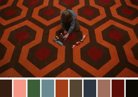
(The Shining, 1980. Dir, Stanley Kubrick)
THE COLOURIST’S RELATIONSHIP WITH
THE CINEMATOGRAPHER
Many, many people involve themselves in the postproduction process. As a colourist,
you’ll find yourself working with the producer, director, and cinematographer in
different proportions that are unique to every project.
The cinematographer’s job during the shoot is to work with the director to plan
for and implement the look of the program while it’s shot. Choosing specific digital formats or film stocks, camera equipment, and lenses, as well as determining
the quality of lighting, are all decisions within the cinematographer’s domain of
responsibility, as is the ultimate quality of the recorded image. For that reason, the
cinematographer has a vested interest in your activities.
It’s worth emphasizing that if a good range of color and contrast isn’t shot during
the production, you won’t have the data necessary to do a good job—you can’t
really add anything that wasn’t there to begin with. In this regard, the cinematographer isn’t working alone; you should also consider that the art department
(set design/dressing, props, wardrobe) exerts direct control over the actual range
of colors that appear in each and every shot. Visually, the filmmaking process is a
symphony of artists working with paint, fabric, light, and optics to create the image
that is ultimately entrusted to your care.
Although the producer or director usually has the final say over the creative aspect
of your work, the cinematographer should be involved in the color correction process as well. This is usually dependent on the size and budget of the project, as well
as the creative relationship of the principals. Typically, the higher the budget, the
more involved the cinematographer will be.
I thought it would be important to highlight the research found for the relationship between the cinematographer and colourist as I'll be both. There is a key correlation between the two, one cannot work without the other and they need to be in sync, shots need to be thought about for the post production side of things for a project to get the optimal level of work. In short, this detailed research of the six labours of the colourist has helped me approach the colour grade in a completely different way to what i'm used to. It has made me realise that I need to make sure I bring the subject matter in focus within the scenes that are appropriate. I'll need to collaborate with Will as well to maximise the colour grade as I can find out from him what he wants to be the main focus of the shot for the audience to be engaging with.
I thought it would be important to highlight the research found for the relationship between the cinematographer and colourist as I'll be both. There is a key correlation between the two, one cannot work without the other and they need to be in sync, shots need to be thought about for the post production side of things for a project to get the optimal level of work. In short, this detailed research of the six labours of the colourist has helped me approach the colour grade in a completely different way to what i'm used to. It has made me realise that I need to make sure I bring the subject matter in focus within the scenes that are appropriate. I'll need to collaborate with Will as well to maximise the colour grade as I can find out from him what he wants to be the main focus of the shot for the audience to be engaging with.
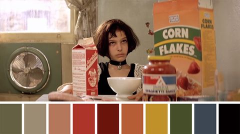
(Leon: The Professional, 1994. Dir, Luc Besson)
With this colour grade of this screenshot from the film Leon:The Professional, you can see the colour palette is quite subdued in terms of colour, they're not saturated, more so quite dull and lethargic colour tones which put emphasise on the story and the characters within it. These moods that the colours represent convey not only the narratives themes but the characters struggles throughout this film. Natalie Portman's skin tone looks the same as the wall behind her, this is evidently intentional as we are meant to assume that she is going through some hardship, quite an ugly one, as the similar tones between herself and the wall denote this. Everything on the table seems to be sapped of saturation, when usually all of these items would pop with colour, this is because the characters are run down, so to put emphasis on that they've dulled the palette and taken away the saturation for this reason. I chose to dissect this specific film because of the subtle desaturated look it presents. As our film would be using quite a heavy saturated aesthetic to add to the surreal tones to our piece, I thought it'd be a good idea to look at something completely opposite to gauge how far down the other end of the spectrum I should go. One thing though that I will be applying to my process of the colour grade will be trying to emulate the consistency of this film. The colour palette is evident throughout the entirety of the film and that's something that i'm striving for as it adds another layer to your film in my opinion. I think this can be achieved by manipulating my footage to have a similar temperature, like this piece here, it has quite a nullified, slightly warm look, where as I want a much more saturated aesthetic. Obviously this film needs a desaturated aesthetic as it's content warrants such, because of the violence and innocence displayed within it, it must have a balance, which why it results it this very beautiful aesthetic.
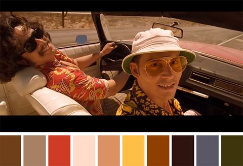
(Fear And Loathing In Las Vegas, 1998. Dir, Terry Gilliam)
I believe this film was incredibly successful in the way it's colour grade demonstrated the characters minds during the hallucination scene, but also how the saturated colours were made to seem normal when they were juxtaposed to the hallucination scenes. I aspire to colour grade how this film was, but I know for sure that most of the film was shot like this first, and then a tint would of been applied onto the exposed film. The skin tones look relatively peachy throughout the skin, and you don't question this because you know the concept of the narrative so if anything it makes even more sense to do so. The fact that they look unrealistic enhances the viewing experience because you're allowed to submerse yourself into this bizarre and surreal story. This is definitely something that I want to try to achieve with our project, I want to make it look surreal with the colour grade by making the skin tones slightly off, making them potentially peachy or of a similar colour because I know that this aesthetic would work well for our project. I'll just need to try it once we get to the post production.
Reference -
Colour correction handbook - Professional techniques for video and cinema, 2nd Edition
Alexa Van Hurkman - Published 2010.
No comments:
Post a Comment