Tuesday, 4 December 2018

Pre-prod. Costume Design


COSTUME DESIGN

For this production, i’ve been tasked with the responsibility of costume design, for which i will detail each characters specific set of clothing, justifying the choices behind the outfits & how it fits the particular style of the episode. As the vodcast is set within the 1940’s the obvious aesthetic for each character will be based around the stated era. I’ve done some research that will guide me and my choices throughout this process so that i demonstrate a clear understanding of what aesthetic will fit the shooting of this era.

1940s men’s fashion for day, sport or evening was styled to make a man feel “larger than life.” During 1941-1945, WWII fabric rations limited cloth to make suits but not style. Middle class men chose basic business suits that haven’t changed dramatically since the beginning of the century. The notorious Zoot Suit with its bright colors, baggy legs and long jackets was a complete deviation from the norm– an underground rebellion worn by inner city youth.  What makes 1940s men’s fashion unique to the decade is the cut of the clothes, the patterns and the stylistic details that demonstrated one’s patriotic support of his country (or lack there of). Zoot suits were associated with gangsters in the early 1940s due to the unpatriotic connections zoot suits had with the anti-establishment movement, as they were styled in such a contrast to the military outfit worn by a lot of men post-war. This is something to keep in mind as our main character George (Buddy Duress) is an Italian fleeing his own country as it descends into a dictatorship, and how he would want to fit in and conform to the communities/set of norms that are already displayed within that current community.


1940s Male Fashion Trends

  • Square pocket suits
  • Zoot styled suits
  • Sturdy cotton canvas coveralls
  • Textured ribbed knits
  • Knit V-neck vests
  • Casual collared shirts
  • The Hawaiian ‘Aloha’ shirt
  • Western style clothing
  • Sports coats
  • The fedora, also called a trilby

Women's fashion in a nutshell, was about creating an hourglass silhouette with masculine details: padded shoulders nipped in high waist tops, and A-line skirts that came down to the knee. This was the everyday shape for clothing, from suits to dresses. Even pants had a similar high waisted, wide leg shape.  If a woman was not naturally an hourglass shape, the clothes were designed to help her achieve the look. Being put together, cheerful, and practical was the job of women during WW2. 40s fashion accessories such as hats, gloves, handbags, and jewelry completed an outfit while natural makeup with bright red lips painting a happy face during difficult times.

1940s Women Fashion Trends
  • Knee length A-line dresses with puffed shoulders in patriotic colors
  • Plaid A-line skirts with white button down blouses
  • Victory suits: man-tailored skirt and jackets
  • Wide leg, high waisted pants
  • Workwear overalls and jeans created the Rosie the Riveter look
  • Shoes – peep-toe heels, loafers, oxfords, wedge sandals
  • The two-piece bikini debuted
  • Hats, turbans, head scarves, snood and flower clips topped women’s heads
  • Lingerie – seamed stockings, socks, simple bra, girdle, slip and panties


Childrens fashion within the 1940s evolved from traditional styles to simpler, more pragmatic garb, although many kids still wore conservative clothing that reflected the way their parents dressed. The true break with old-fashioned children's wear didn't come until the 1950s. Cultural and international events influenced clothing styles in the 1940s, particularly the Second World War, which led to a need for cheap, utilitarian clothes. Some styles, White baby gowns, little girl’s dresses, boys pant suits and an assortment of shoes were very prevalent in that era. 1940s children’s clothing came in primary colours red, blue, white, yellow and green. Dresses were above the knee for toddlers and below the knee for big girls. A sash bow around the waist, a few simple ruffles around the puff sleeves and you have yourself an adorable 1940s children’s dress. Boys clothes were mostly casual striped knit shirt with shorts or pants. For dress-up time they wore a mini suit that looked like Dad’s. Shoes for boys embraced the penny loafer or saddle shoe. For girls, it was the classic black mary jane with socks.

1940s Childrens Fashion Trends

·       Long plaid dresses for girls
·       Black mary jane’s for girls
·       Knee cut dresses for girls
·       Cream loafers for girls
·       Striped knit shirt for boys
·       Boxy knit jumper for boys
·       Mini suit for boys
·       Penny loafers for boys
·       Saddle shoe for boys
·       Baby grows, unisex

BUDDY DURESS (George)
 

Buddy Duress’ character is a 13 year old adolescent when he moves to America, he then gets labourer job, so within this space of time he’ll be dressed with working class attire, confirming to the generic look as he will be trying his best to fit in. As his job is quite hands on, it would make sense for him to be wearing sturdy cotton canvas coveralls, these were worn by men that had to get dirty on the job. They were all one piece that buttoned down through the fly with a straight leg. They belted at the waist, had long sleeves for protection and a pointed collar. They also had big patch pockets on the chest for keeping things handy. He’ll also be wearing a fedora as for him a major thing is to be a part of the society he works in, and as they were a staple piece of fashion within that period, he’d want to maximise every opportunity he had to feel at one with the community surrounding him.


However when he gets married, his costume will develop into a mature, professional & slightly wealthier aesthetic. As his business flourishes, so does his wage packet thus resulting in his style correlating with that, bringing about a more sophisticated look. This would be depicted through the use of costume choice for George, by him wearing a plaid tailored suit, as tweed, herringbone, check, and overplaids were also very popular suiting patterns. The reasoning behind this choice is because he’s still wanting to fit in, he’s fled from his own country, knows he feels judged by the locals, and just wants to belong & have a sense of that.

JODIE COMER - (Jenny)

Jodie Comer’s character dress sense will develop from the first scene she is in, (when she first meets George) as she meets him in the ‘Music Box’ where she’ll be dressed in a casual outfit, which would be a knee length dress, stuck with a plaid A-line skirt and peep-toe heels. Jenny is also from a relatively working class background, so nothing too sophisticated, however it’s only when she gets married and the wealth from George begins to weave it’s way into her & the family that her style begins to sophisticate & develop accordingly.
         
Part of Jenny’s outfit throughout certain scenes.  

JOHN HOGG - (John Sodder)

John is first seen as a baby, but then is shown later on as a 24 year old man, so i’ll have to dress him appropriately for his age & the status that he has within the community. As his father (George) is particularly wealthy at this period in his life, this will rub off on John in terms of his aesthetic, so he will be wearing a smart, casual attire. His outfit will consist of a square pocket suit, with plaid matching suit pants, finished off with a pair of tan leather loafers. Obviously throughout the piece, his outfit will change, as for each scene he is in will warrant a different outfit, however this stated outfit is the generic aesthetic he will be set.
  Part of John’s outfit throughout certain scene’s.

JOSHUA GLENISTER - (George Junior)
George Junior is a 16 year old adolescent, who only features when walking his sisters to school, so his outfit would be styled based on the wealth & ease of his role. As he is living off the wealth & protection from his father, he will dress in a similar ilk to that of the eldest brother, John. However it will be much more casual as he’s still a teenager and not in work yet. The outfit for George Jnr, will consist of a knitter jumper, over the top of an open collared shirt, finished with some boxy cut straight legged trousers & black leather loafers.
Part of George Jnr’s throughout certain scenes.


KATHERINE ROSE MORLEY - (Marion)
Marion is a 16 year old girl, who has a job, as a waitress in a local cafe. She is seen in two scenes, one sprinting to the neighbors house after the discovery of the fire, and the other walking her sisters to school. She will be dressed with smart attire, as the wealth, like the other family members, has had an influence over the aesthetic. Her outfit will consist of, a boxy red colour coat, with some wide leg high waisted pants, finished with some toe loafers.
Part of Marion’s outfit throughout certain scene’s.


MACKENZIE FOY - (Martha)
Martha is relatively young in comparison to the other main siblings who feature, however her dress code would be catered to fit her age more appropriately than the rest. She is still her dad’s favourite, so she will dress even more sophisticated than the majority of the other siblings due to this fact. Her style will be slightly glamorized & sheek, for her age rather mature. She’s only in two scenes, and is actually one of the children that goes missing. So for the scene’s that she does feature in, the outfit will consist of, a red knitted jumper, boxy plaid patterned skirt, with some wedge sandals.
Part of Martha’s outfit throughout certain scenes.


SKYLA ROLLINS - (Sylvia)

Sylvia features in one of the most important scenes, the escaping of the house when it’s set on fire. As she is just 2 years old, her outfit will portray this, and i will depict it through her styling. Sylvia’s outfit will consist of, a teal baby grow, with some small baby loafers & a beige wool hat. This is purposeful to give the young child even more of an innocent aesthetic.
     
Part of Sylvia's out throughout certain scenes.


CHRISTOPHER TEMBEY - (Terry & Police member)
TERRY
Terry’s character is being played by an actor who will be multi-rolling, so i have to make sure that the outfit’s selected for both have a high contrast to affirm which character is which. This character only features in one scene which is situated in the street, and his character is in the street. This outfit will include, a white shirt, brown cut wide leg trousers, khaki open collared shirt, finished with some black leather loafers.

POLICE MEMBER
This officer only features for a small scene, which takes place in the interrogation room. However he will be dressed accordingly to the specific outfits that were worn by the police force in that period. This outfit will include a full navy suit, with boxy wide leg fitting trousers, a black leather belt, finished with a pair of smart varnished black leather loafers
Part of the Police Member’s outfit throughout certain scenes.
Part of Terry’s outfit throughout certain scenes.


STEVEN CLARK - (Fire Chief)
The fire chief features in only one scene, when he is contacted by the neighbour. So for this he won’t actually be in his typical fireman aesthetic. As the character at this current stage of the narrative is in his home, late at night, he’ll be dressed appropriately to add to the authenticity of the filming. So the character’s outfit will consist of, a white wool vest, with plaid bed trousers, finished with a pair of ragged slip on loafers. This is due to the fact that the character has been woken up from his sleep in the middle of the night, and hasn’t had time to get ready.

Part of the Fire Chief’s outfit throughout certain scenes.

Monday, 3 December 2018

Pre-prod - Research for D.O.P - Natasha Braier

As my chosen technique to focus on is being the Director of Photography, i'm now researching DOPs for inspiration & guidance of the skill. The technique is really composed of 4 main attributes, these include lighting, framing, camera movement & colour/tone, and with these attributes a films world is created & conveyed across the screen. One D.O.P i will be focusing & researching within this blog is Natasha Braier. She's an Argentinian-born D.O.P and is best known for her work on Neon Demon (2016). She has a unique way of working with light and that is the primary reason i decided to research her. 
Image result for natasha braier

(Natasha Braier)
Link to her work
http://www.natashabraier.com/html/en/stills/Vanity-Fair/


NEON DEMON -
A quote from her about working with Nicolas Winding Refn, she states '“When you see ‘Neon Demon,’ every shot, every aesthetic decision is so extreme and so confident that you’d think it’s totally planned from the beginning, but the interesting thing is that it’s not,”. The film itself was quite vacuous, but the visual composition was utterly astonishing, and that's why i've chose Natasha to converse about. 


LIGHTING
Natasha's lighting is extremely saturated and uses a lot of different colour gels to bring out various types of emotions throughout Neon Demon. She's very abstract in her usage of lighting, and uses it's full potential to effectively portray the narratives themes & topics beautifully.


COLOUR/TONE
Braier didn't want ND (Neon Demon) to be a authentic representation of the fashion industry, nor did she want it to reference the cool, slick look of the magazine print ads featuring super-models.  Instead, her reference for the big fashionista party, where the innocent Jesse first comes into contact with other models, was the feeling Alice had entering Wonderland.
A quote from Braier herself, “The colors are always subtly changing in this scene, the blue becomes turquoise, and then liliac,” ... “The shifting colors does something to your brain, I want you to feel how alien and overwhelming this world is to her.”
"The Neon Demon"

Then it gets on to the second part of the film, in which Jesse has a realisation of how beautiful she is, and the power that it brings, losing that innocence for arrogance. After this, the colour palette completely changes to red throughout shots with her in, clearly forboding the change of mind & emphasis on the power & dominance she is now newly craving. 


FRAMING/CAMERA MOVEMENT
The movement within this piece was quite soft & static, complimentary of the characters within, it dragged out scenes through it's little movement, to emphasise the characters more & depict the beauty & power of each individual. It was a clever way of indicating power by Natasha Braier and I feel it worked.


WHY RESEARCH HER & WHAT AFFECT IT HAS HAD ON OUR PROJECT?
One of the main reasons I decided to research Natasha was because of how much I enjoyed the visuals to the film. The actual narrative i wasn't so keen on, i thought it was a vacuous, pointless plot with no actual substance to it, that it was style over substance. However, I do love the visual side to it, and if I look at it from a camera person's perspective its a triumph. It's her styling & lighting that is used so effectively, and I want to try and learn those skills, so that I can apply to my own work in the future. The film also deals with ominous themes, and it's intriguing to see the lighting and composition used throughout those certain dark scenes for inspiration for this current project. 


Pre-Prod. Location Design

LOCATION DESIGN

Through research & guidance from other production designers, location scouts and much deliberating with Aimee, we've decided to go with two primary locations, with the potential addition to a few other on location spots. The two primary locations will be the studios that're based here in the UK, London specifically (Camberwell film & photo hire space), and the second would be out on location, in the United States of America, in the state of West Virginia, Fayetteville. The house is rather large, and has the right aesthetic & age, having been built in 1788, here are some pictures of both locations to really get a sense of what we're dealing with. The location is one of the many important aspects of filming, just as finding the right actors to portray a role, and just as important as the choice of music used in the film. 
Noah-and-Allie-from-The-Notebook-2004
There are a lot of things to consider when choosing the right location for the shoot, the lighting, the external variables, how things can be controlled, i.e light, sound, people etc, and how manipulated the surroundings can be to suit your desired style. You want to try and find the most natural & appropriate location, which leaves no raised eyebrows amongst your audience in terms of questioning the validity of it as this is imperative to the films success. A film's location is the most important and active aspect in filming. The audience will appreciate the visuals pouring over the scene details and start to immerse themselves within the film. A film I watched recently, The Notebook, has a scene in it that perfectly summarises my point with its own choice of location. When Noah takes Allie out canoeing, white geese covered the surface of the pond, and as Noah navigated their way among the Cyprus trees; they were happy. It was just beginning to rain when their moods changed and Allie became angry—angry because she believed that Noah never wrote to her like he promised her that he would—she tells Noah it was over, but then, he reaches, pulls Allie into his arms and…well, this scene is probably one of the most memorable scenes to some people. Its impact and validity weighed heavily on the location where this scene was shot. 

A series that also uses it's location to maximise it's product value & it's overall sense of validity is True Detective, - a quick synopsis - it's constructed as a nonlinear narrative, season one focuses on Louisiana State Police homicide detectives Rustin "Rust" Cohle(Matthew McConaughey) and Martin "Marty" Hart (Woody Harrelson), who investigated the murder of prostitute Dora Lange in 1995. 

Oak Alley Plantation - Key Location 
Oak Alley Plantation’s famous big house and rows of live oak trees in True Detective’s pilot episode, you will see some of the stunning, lush landscape that surrounds them. In the show, the scene where detectives Rust Cohle and Marty Hart discover Dora Lange’s body. That was filmed in a remote section of the plantation’s property, this automatically adding more depth to the episode, allowing for a more immersive viewing experience. I think without the usage of this location, you wouldn't get the same experience & if anything a worse one because the audience watching may potentially question the validity.

Fort Macomb - Key Location
Fans of True Detective learn in an early episode of a frightening and mysterious place called Carcosa. It is one of the main settings for the show, and with its maze of nearly 200-year-old brick catacombs, also happens to be one of the most scenic & atmospheric locations for the first series. It's also the history behind this location that adds to the fictional version. It's actual name is Forc Macomb, and it was built roughly in the 1800s to protect New Orleans from invaders. It was then used during the Civil War, which i found fascinating, as this location has such a rich history that evidently adds more than any studio created environment could. I know by saying that it goes against our argument for using a studio space but for the right reasons, both on location shoots & studios offer equally good things. The location for this scene was pivotal in setting the tone & adding to the suspense & intensity of the scene, as without that location, it would of never really had the same impact on the audience.   


(Fort Macomb)

ON LOCATION - SPRING TAVERN HOUSE, FAYETTEVILLE, U.S 1788
Image result for big house fayetteville
This location would be key in establishing the tone & general aesthetic for the project. I feel that this particular house is right for the filming outside of the property because it's grand, it shows wealth, which the family had & it would fit all of the family members within it. It's also situated within the actual neighbour of the disaster, so there would be some connection there which i feel would add to the authenticity of the episode, obviously though bearing that in mind, and being sensitive to the topic we're tackling & representing. It will also add some kind of validity & would allow the audience to become immersed whilst watching it, creating an overall fluid, organic & impressive piece. Another reason why we felt this location would be right for our project is that it matches up with the script, and that it a key element in searching for a location, making sure that they match from written to their visual interpretation. Overall I think this location will bring only a positive influence in what we want to achieve & should add to the production values in every way. 

IN STUDIO - CAMBERWELL FILM & PHOTO HIRE SPACE
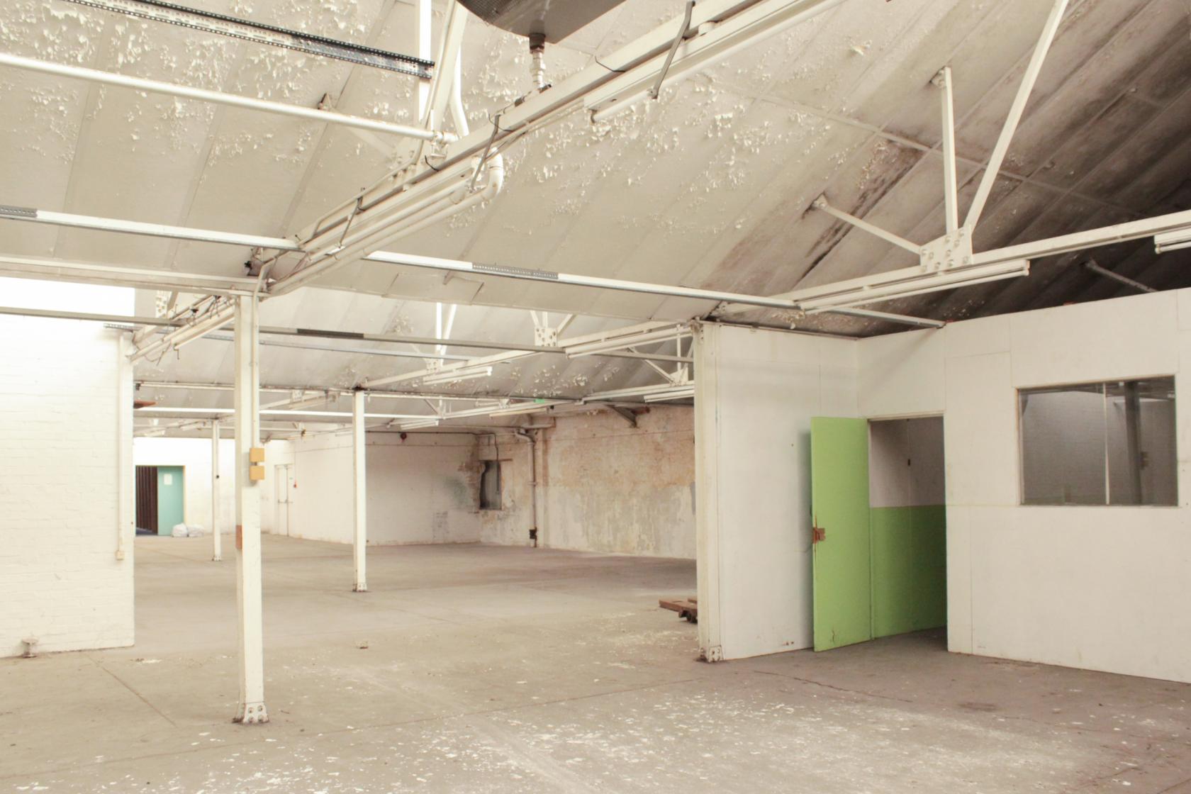
As the majority of our actors/actresses will be scouted from the U.K we feel it would be cost effect to base the majority of the studio shoots here. The studio space also allows us to be as creative as possible, with no restrictions to light changes from being out in the open spaces, & interaction with the general public. We would have control over all filming variables and that is pivotal to what would be the success of this project. So as the episode features the living room, the mum & dads room, the boys bedroom, the hallway & stairs, we feel we could create each room, with a set designer specifically the way we would want it, and a way that would allow us to maximise our camera capacity in terms of shooting styles & techniques. This location brings security, affordability which Aimee covers within the budget, a creative sense of freedom, perfect sound as it would have no interference from outside like you'd get on location, the right colour & tone for the location would be easily achievable within the studio space as all light is controlled. Editing could also be done whilst sitting in the studio, with no stress of the outside world breathing down your neck, also manipulating our own lighting kit to fit the tone, and not relying on the sun or reflectors. The benefits of shooting within the studio space for these particular scenes outweigh those of shooting out on location. The scenes would only be shots of the family within the house, and I feel by choosing to shoot them in a studio space would be the right call. 


OTHER LOCATIONS POTENTIALLY NEEDED - 
As the two location's stated above would be our primary sources, there are still scenes within our production that need to be accounted for in terms of getting locations confirmed & where they actually would be filmed. These locations will come clearer to us once we've finalised the script. Then we will be able to confirm the minor locations which will only feature for a few scenes. 


Saturday, 1 December 2018

Pre-prod. Title sequence research


TITLE SEQUENCE RESEARCH FOR VISUALS


STRANGER THINGS 

How its effective - 
For audience members with certain pop culture knowledge, the moment they saw the opening titles for Stranger Things, geeky delight must of surged through their veins. The combination of a moody pulsing Blade Runner-like synth sound, accompanied with a genre-associated nostalgic typeface, conjured an instant shorthand evocation of the 1980s pop culture of Steven Spielberg, John Carpenter and Stephen King.. Which is precisely what Stranger Things aspires to do!
Speaking of the significant auther King, his work directly played a role in the conception for subconsciously capturing that essence of horror and homage. But it’s not just homage for its own sake. It’s homage that has a clear purpose to serve the mood. The eerie music leaves little doubt as to what we’ll see. And the disassembled characters, steadily connecting to spell the show’s title, sweetly convey the continuous uncertainty, disarray, and enigma surrounding the shows events. It’s that deft juggling of multiple purpose that have made it such an iconic sequence.
This title sequence is immensely effective in the way it portrays the tone & themes of the series narrative. It's a great depiction as to what the viewer is to expect, with the use of the vibrate red strobe lights for the font, giving it that signature finish. 


Watching this title sequence gave me some interesting concepts to play around with in relation to our own for this project. 


FURTHER TESTING & RESEARCH 


So with research came ideas, and after watching a few music videos that used a really eye-catching effect, i decided to give it a try. The effect was a smart edit, in which the video plays out a photo being take. I wanted this desired effect within the title sequence as i felt it crossed over the new to the old. I'm not sure if Aimee was keen, so if it's not included in the final edit, then that will be why.  

Here is a little tester video for 


I had to crop the 35mm developed image, into the right aspect ratio, change its dimensions & size for editing purposes, then export it as a jpeg, and then put it onto premiere pro. 

Once it was in premiere pro i then placed it over the gun MOV. row, giving this nice vintage film effect. I thought it worked quite well, but you just have to make sure the shots match up as i had issues with it looking quite jarring & uneasy on the eye. I think this suits the aesthetic that we're trying to emulate so I can see this working very well within our title sequence.


Friday, 30 November 2018

Pre-prod. Shotlist

SHOTLIST

So for this pre-production packet i've taken up the responsibility of putting together a shot list. Within this shot list is basically a compiled set of shots & instructions of how the shoot would go, this would enable myself and the hypothetical 'crew' to work as effective & efficiently as possible. 


THE IMPORTANCE OF A SHOT LIST 

It forces you to make choices
I've learn that any set is pretty chaotic beast, and not necessarily the best environment to be making tough choices.
Shot listing forces you to think about what you want and what is needed to finish a project. If you want close ups, long shots, aerial shots, tracking shots, quickly that list grows beyond the possibility of what can and cannot be filmed. That forces me to ask what I actually need to tell the story. I can then cut the shots down in the safety of my own space, without the pressure of others on my case. You want that freedom, that everyone is on the same page, because you've created this shot list for everyone to see. 


It helps you decide what comes first - 
Now that I have a shot list, I know everything I need to tell the story. The next step is to decide on a shooting order. This is often an overlooked but important step. When you’re on set every minute is precious, and the more you know beforehand the more shots you can get processed.

It helps you invest time where it counts -
The next step is to estimate how long each shot is going to take. Some shots are easy and some are quite complex. This step is most crucial, because it makes sure I don’t run out of time for things that matter most. Knowing I have a really important shot at the end of the list, prevents me getting precious at the beginning. I rush the unimportant stuff, rather then run out of time on what I care about most.


Here is the completed shot list - 


Within this shotlist, i've made sure it's as effect as possible in the sense that it has everything on it that would be of use to us come the shoot dates. It's been written as efficiently as possible, making sure nothing has been left out, that's why on completing the shotlist, i had my storyboards there to aid my decision making throughout this process. This is an essential part of what a D.O.P has to complete for this is what guides the person through the shoot days. Obviously on the day of shooting, regardless of this being a hypothetical pre-production package, there may potentially be certain aspects that may change due to timing constraints, or lighting if out on location, so this is just set in place for a rough guide. This would be the bones/structure of the shoot day, with an option to go off key, if we felt that there were more shots to gather for the edit. 


Monday, 26 November 2018

Pre.prod - Completed storyboards


Having finally completed both storyboards for the whole pilot episode and the opening title sequence, we can now both approach the episode with more of a visual understanding. This will help Aimee with her editing approach and also myself for creating a shot list. 
Here is the finalised storyboard - 

OPENING TITLE SEQUENCE STORYBOARD


The storyboard for the opening title sequence features a mixture of archive footage and original shot footage by myself. Some of the archive footage has been sought after, for reasons i will specify later, but i just want to focus of what images were needed & why. I wanted footage of people, potentially blurred out faces, of urban and suburban landscapes, to juxtaposes the city to the freedom of the countryside. I wanted to find a lot of close ups, that would have a great effect once they would be placed on the timeline against extreme long shots, as i feel it would create a tone that would fit our piece. The use of archive footage throughout the opening title sequence is to effectively portray the kind of aesthetic & style we would want to try and capture when shooting the actual pilot. The opening title sequence is meant to, in someway demonstrate how it would look visually, or at least put across the kind of essence of the series. The use of original footage which I captured on my own camera, Sony A7S, was to cut inbetween the archive, as more of a reminder that it's not just going to be covering pieces from the past, but the present, and that there are several more episodes to this series which involve present themes and topics, such as the gun, and contemporary objects.  


PILOT EPISODE STORYBOARD


How I created this storyboard was actually through a written interpretation of the original podcast. Me and Aimee, spent a two days, dissecting the whole hour long podcast, writing down a visual interpretation of each specific moment that was being discussed within it. This took a very long time, & a lot of our patience, but eventually we were left with 8-9 pages of pure notes, basically a visual narrative for the podcast. So I had to then transform those notes, and put them into the storyboard as a visual picture interpretation instead. Having those notes made it a much easier experience, had we not done the preparation beforehand, this process would of taken much longer than it had done. 
You'll see that the shots are quite generic, that there isn't anything you wouldn't typically find within a drama/period piece, and that's right. Even though this is a unique format of screening a medium, it's still going to be shot like a drama period, as research has provided us with answers that state it's how the footage is exported that makes the vodcast what it is. So i've made the conscientious decision to shoot not too complex, but not too basic either. In one scene of the storyboard i've tried to imitate a scene from the series Fargo, (Series 2) where there is a split screen whilst it tails two characters off on different paths. I loved the way it was choosing this specific method to tell the story in such a manner, it was totally original & fantastic to watch.  
Throughout the storyboard you'll see that the camera movement is quite heavy with handheld action, this is due to our actual format & it being a new developing one. I believe that it would be quite a bold move and something that could work, as the audience we aim for is currently just a listener, we hope the handheld would grip them, like it would with a film or TV series. Handheld camera movement is proven to immerse the viewer in a different way to any other camera movement, as it allows you to feel what the character is feeling and to be within breathing distance of them, metaphorically speaking.